

The color theory covers many definitions, ideas, and design applications that might fill multiple encyclopedias. The color wheel, color harmony, and the context in which colors are utilized are the three logical and practical core concepts of color theory.
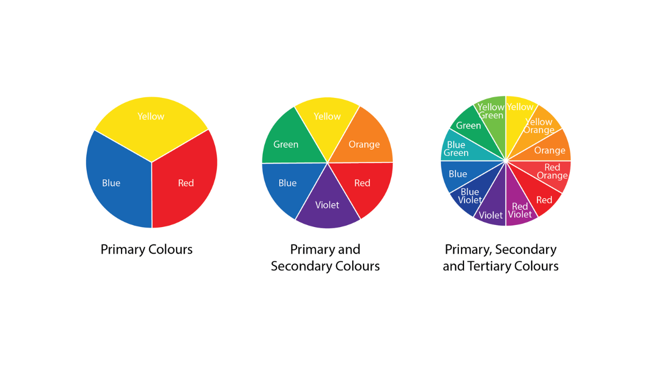
THE COLOR WHEEL
- Primary Color Wheel
Red, yellow, and blue (RGB) are the primary colors.
Primary colors are the three pigment colors that, according to conventional color theory (used in paint and pigments), cannot be combined or created by any other colors.
These three colors are the source of all other colors. - Secondary Color Wheel
Green, orange, and purple are the secondary colors.
These hues result from combining primary colors. - Tertiary Colors
Yellow-orange, red-orange, blue-purple, green-blue, purple-purple, and yellow-green
These are the hues that result from combining a primary and a secondary hue. Due to this, colors have two-word names like blue-green, red-violet, and yellow-orange.
THE COLOR TYPES
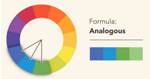
- Analogous Colors
On a 12-part color wheel, analogous colors are any three hues that are next to one another, such as yellow-green, yellow, and yellow-orange. One of the three hues predominates more frequently.
Uses colors that are next to each other on the wheel.
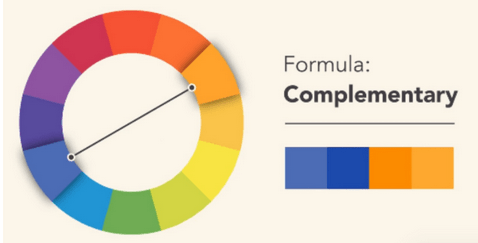
- Complimentary Colors
Any two hues that contrast sharply from one another are said to be complementary, like red and green, red-purple, and yellow-green. Several varieties of yellow-green may be seen in the leaves, and several red-purple hues can be seen in the orchid in the picture above. Maximum stability and contrast are produced by these clashing hues.
It uses colors that are on opposite sides of the color wheel.
- Natural Colors
Color harmony may be started off perfectly by looking at nature. Whether or not the color scheme in the aforementioned artwork follows a scientific formula for color harmony, the red, yellow, and green elements work well together to produce a pleasing pattern. - Monochromatic
- Use one color with different saturations and brightnesses.
- is a design choice that uses variations of a single color.
- By utilizing different shades, tints, and tones of the chosen color, a monochromatic scheme can bring depth and visual interest to a room.
- The use of light and dark values within the same color family adds dimension and creates a soothing atmosphere.
- Whether it’s a serene blue living room or an elegant gray bedroom, the monochromatic color scheme offers endless possibilities for creating a cohesive and sophisticated look.
- With its timeless appeal and versatility, the monochromatic color scheme is an excellent choice for those seeking a refined and polished design statement.
-
- This scheme involves pairing colors that are opposite each other on the color wheel.
- The complementary color scheme is often used in branding and advertising to grab attention and make a statement.
- It can also be used in interior design to create dynamic and energetic spaces.
- When using this scheme, it’s important to consider the intensity of the colors and their overall balance within the design.
- By carefully selecting and harmonizing complementary colors, you can achieve a visually pleasing result that is both eye-catching and harmonious.Complementary
- Split Complementary
Uses the two colors that are on either side of a color’s complement. - Triadic
Triadic color schemes create harmonious and dynamic visuals by evenly spaced three colors, enhancing vibrancy and energy in designs. Selecting complementary colors and maintaining consistent tone creates cohesive, lasting visuals in graphic design, interior decoration, and fashion. - Square
The square color scheme is a popular choice for modern interior design, creating a calm and orderly atmosphere. It consists of neutral tones like whites, grays, and blacks, with pops of color in accent pieces or artwork. This scheme allows for easy coordination with furniture and accessories, creating a cohesive and visually pleasing look. - Rectangle
- is a classic choice for interior design.
- With its clean lines and balanced proportions, it brings a sense of elegance and sophistication to any space.
- The combination of neutral tones such as beige, taupe, and ivory creates a timeless look that never goes out of style.
- The Rectangle color scheme is versatile and works well in both traditional and contemporary settings.
- It is the perfect choice for those who appreciate understated beauty and want to create a space that exudes effortless charm.
- is a vibrant and eye-catching choice for any space.
- With its wide range of hues and tones, this scheme allows for endless possibilities in creating a visually stunning environment.
- From bold and saturated primary colors to soft and subtle pastels, the Polychromatic color scheme offers something for every taste and style.
- So why settle for a monotonous color palette when you can embrace the vibrancy of the Polychromatic scheme?
- Let your imagination run wild and transform your space into a true work ofPolychromatic
Color Tools
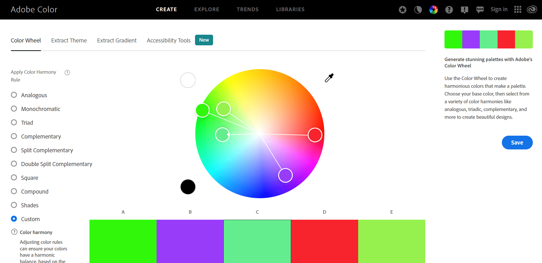
Adobe Color tool allows users to create and explore color palettes for design projects with an intuitive interface. It extracts colors from images, generates harmonious schemes, and accesses popular trends. With an extensive library of pre-existing color themes, users can find inspiration from other designers and artists. The tool seamlessly integrates with other Adobe Creative Cloud applications, enabling users to unleash their creativity and make their designs visually captivating.
Example: Using contrast color and font to design a landing page.

Category :
Tags :