What is information architecture?
If you want to build a great house, the person to call is an architect.
We all know this, but architecture applies not only to traditional buildings but also to the information space.
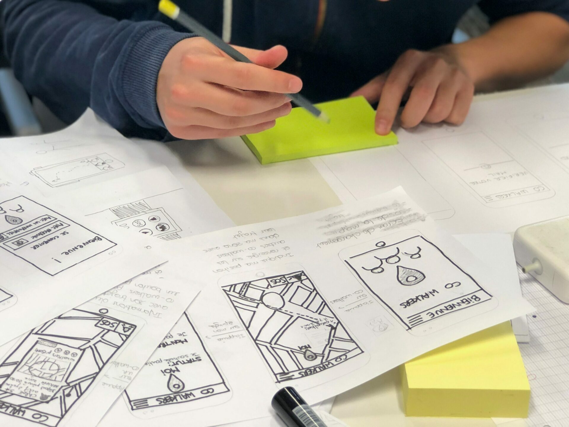
Information architecture is a discipline that focuses on the organization of information within digital products.
For example, when designers create apps and websites, they lay out each individual screen so that the user can easily find the information they need.
For a designer, information architecture is a clear demonstration of conceptual ideas that can be shown to customers, investors, designers, etc.

- Information architecture is an excellent guide for designers and developers. The more detailed the information architecture is, the easier it is to develop a project in the future.
- IA is a good thing because it can easily track the presence of “deadlock” situations for a user in the process of interaction.
The value of information architecture
- Content is the reason why people visit websites. We all know how important it is to produce content that users will find valuable, but what’s equally important is to make sure that the content is easy to find.
- When finding information becomes too complicated or too slow, there’s a risk that people will simply abandon it.
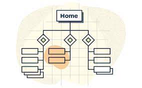
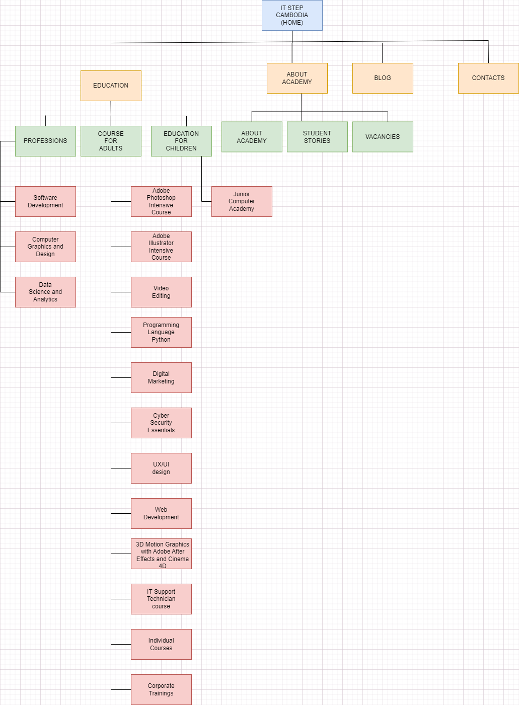
Example of Information architecture
Information Architecture Principles
Principles of IA were first proposed by information architect and UX designer in a 2010.
These principles have been widely adopted in the IA field and can help guide your designs.
information architecture scheme
- To create a convenient scheme one should follow certain principles.
- The first is the principle of disclosure. Even if there is a lot of information, the designer will leave exactly as much data on the page as the user needs for a meaningful and quick choice.
- With this principle, the user receives information in portions – from page to page.
- The menu should looks more compact and does not overload the perception.
- It is difficult for users to perceive many different text blocks or just category names.
- The best option is illustrative examples through which you can easily understand which category contains what you need
- The third principle is the principle of front doors.
- Recently, the value of the home page has significantly decreased. This is because search engines immediately transfer a user to the pages relevant to the search query.
- Opening a website through a search service, a user cannot always find important and necessary information. This happens not only because it may not be there, but also because the page itself is poorly arranged.
- Therefore, developers should pay considerable attention not only to the main page, but also
to secondary sub-pages. - The last principle is the principle of multiple classification.
- You can find the necessary information on a website through a search, a list, or by specific categories. All this is possible because an OS now adheres to the principle of multiple classification.
- Sometimes designers make an explicit focus on one type of search, leveling others. In this case, the user may not notice the alternative
- But there are also such cases when search options are placed in a separate block on a page, and they are equal to each other
- they should not forget to show examples of interaction and filtering results, if possible.